This post has been superseded - Hava's 2023 UI is significantly different.
We're happy to announce general availability of the new hava.io user interface. The result of many many hours of performance tweaks and design improvements this implementation of the cleaner UI has delivered improved navigation, more screen area for your diagrams so you can focus on the things that matter to you.
If this is the first time you have discovered us, hava.io is a SaaS or self hosted applications that automatically generates interactive cloud network topology diagrams when you connect your AWS, GCP or Azure cloud accounts. An excellent cloudcraft alternative.
Hava produces interactive infrastructure diagrams, detailed AWS security diagrams, Container diagrams and comprehensive costed resource lists that are automatically updated when a configuration change is detected. The software also saves pre-state change copies of your network documentation in a version history, so you can go back and look at superseded configs whenever you like.
On top of the diagrams, Hava also has a reporting module containing additional reports like the AWS Best Practice Compliance report which draws on AWS Well Architected principals to highlight potential issues with your AWS configuration.
This UI refresh released in August 2020 contains a number of significant improvements which we'll take a look at here.
Cloud Diagram Environments Dashboard
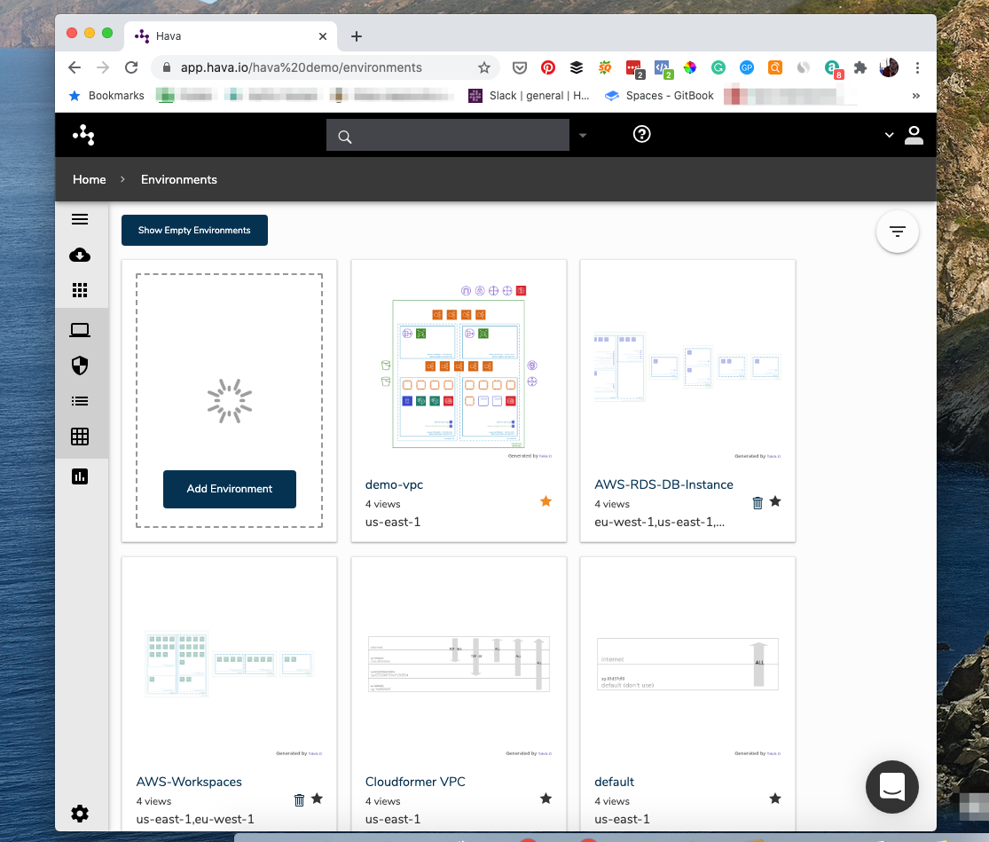
When you now open your Hava dashboard, you'll notice the increased area that displays the tiles representing your cloud infrastructure diagrams.
The list of connected data sources is hidden by default and replaced with a hide/reveal icon in the top right hand corner of the dashboard
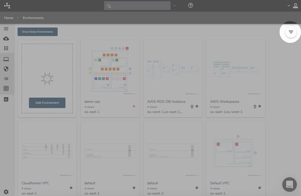
Selecting the reveal icon will expand the list of connected data sources and the "Filter Environments" text selection box:
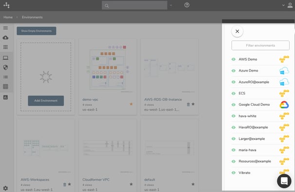
This expanded dialogue enables you to control the display of network topology diagrams that have already been automatically created by Hava, or as a result of you executing a custom query or deep search and saving the diagrams. Clicking the eye icon adjacent to the data source name will switch on/off ALL diagrams related to that data source.
The filter environments input field at the top of the dialogue box enables you to filter on diagram names or regions so you can narrow down and customise your own personal dashboard to only show the diagrams you are interested in, which helps in larger networks or organisations if you are only concerned with a particular project or data source. Entering "Dev" for instance will hide all diagrams that do not have that string in the diagram title, or entering 'us-east-1' will only show diagrams from the us-east-1 region (or diagrams whose saved name includes us-east-1).
Cloud Diagram Dashboard Navigation
All navigation options have been relocated to a collapsable sidebar menu on the left of the dashboard.
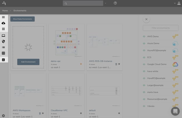
Selecting the top hamburger icon expands the sidebar menu to reveal options to manage data sources, control which type of diagrams to display on the dashboard and to open up the new reports menu.
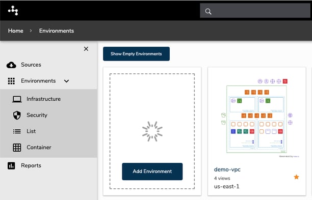
Selecting Sources will change the dashboard contents to display all the attached cloud accounts you have connected to your Hava SaaS or self hosted application.
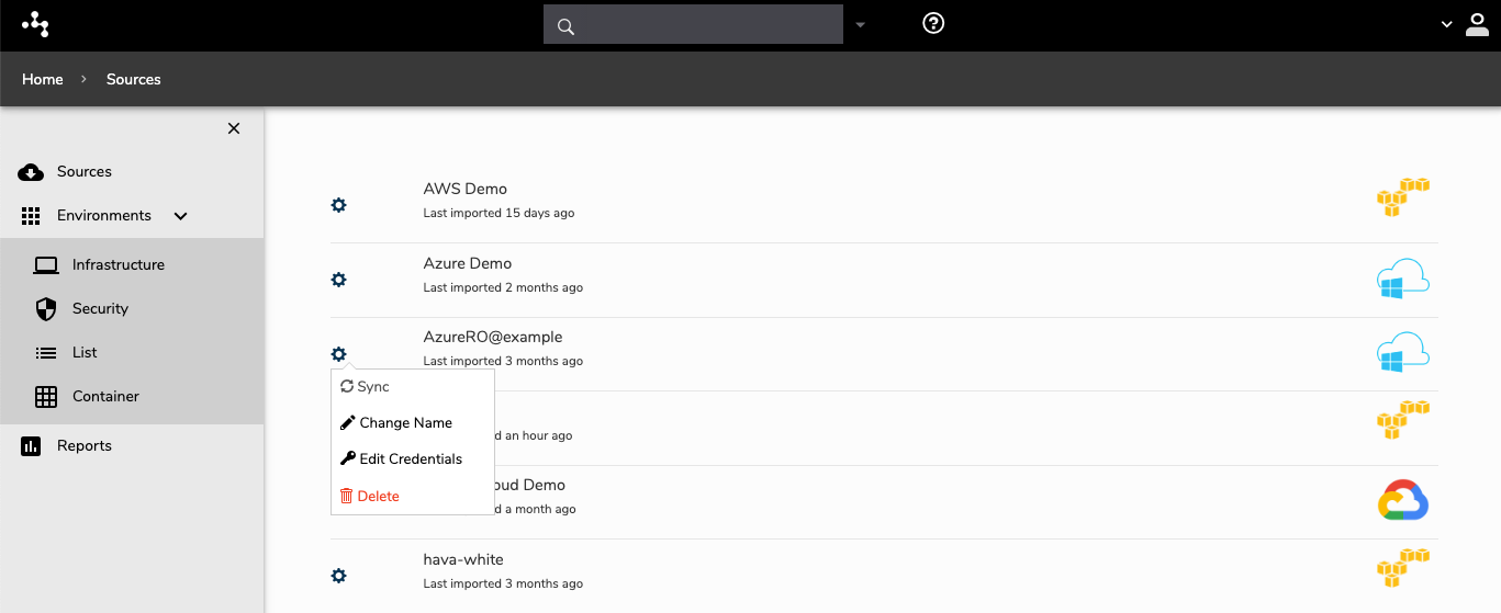
Once in the data sources screen, you can perform maintenance functions on your data source connections including:
- Invoking an immediate Sync between your cloud config and Hava
- Changing the name of the data source - This relates to the Hava app only, not your cloud provider account.
- Edit the credentials used to connect to your cloud configuration data
- Delete the data source.
The "Environments" option on the sidebar menu changes the type of diagrams displayed on your dashboard. The four sub-menu options correspond to the four main types of diagrams Hava creates.
The final option on the sidebar menu is the "Reports" module. Separate from the network infrastructure diagrams, the reports Hava creates enable users to access reports relating to things like AWS well-architected best practice analysis.
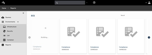
These reports are also generated automatically and just like all the standard Hava diagrams, a version history is retained so you are able to inspect and investigate any problems or compliance warnings that are present now, or have been present at some point in the past.
User and Account Settings
Your Hava personal and account settings can now be located on the bottom left of the dashboard.
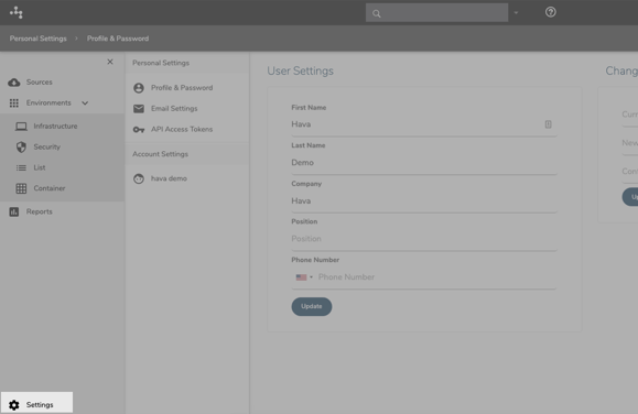
Once you access the settings dashboard page you will have the option to change your personal profile and password settings, email and access your API Access Tokens.
You can also find your account settings here including your account name, billing plan, cancel option, billing history and teams.
Diagram View
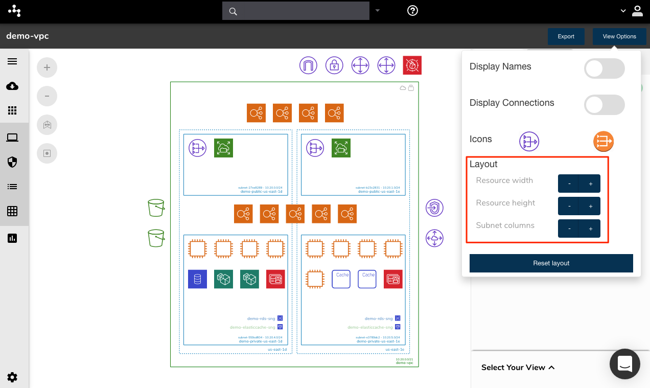
When you enter the diagram view, the core interactive diagram details remain the same, however, you will now find the option to select the different diagram view types in the bottom right hand corner of the diagram.
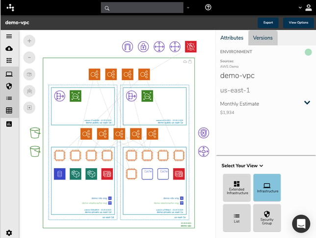
After selecting the diagram view you wish use, you can minimise the view options to leave more screen area to display resource attributes as you select them on the diagram.
Hava will automatically produce self-updating AWS network diagrams, Google Cloud diagrams and Microsoft Azure network topology diagrams once you connect your cloud accounts. Using the custom query builder, you can also create custom diagrams sourcing data from multiple accounts, hybrid cloud diagrams and diagrams based on regions, tags, vpcs, networks, resource names, resource groups, gcp projects or nominated IP addresses.
To get access to the new Hava UI, SaaS clients will automatically see the changes at next login. Enterprise self-hosted customers will get an update notification.
If you are not using Hava yet, there is a free 14 day trial available via the button below.


